What Is It?
Visual noise is noise that distracts from what is otherwise displayed on the screen. It is too much detail, too many colors mixed together, too much of too much in a small concentrated spot. And the worse case is when you use blocks whose skins are the source of the noise and are used everywhere. Then you have a map full of noise.To better understand what visual noise is, we could ask how it is introduced into a map.
Visual noise is created by things like thin lines of extreme contrast to their background that serve no purpose – like graffiti on a wall. Only they are worse than graffiti because they are not graffiti. Contrasts in fine detail can yield visual noise unless the fine detail looks like it belongs there. In most of the Canvases of Halo 4, you see fine lines that move along in all directions and you won’t be able to make them look like any of them are intended or were meant to be there.
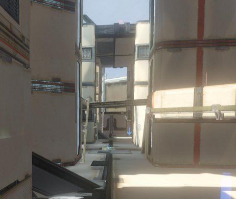
In some cases it can be as simple as lines that are not at the same elevation, or at angles to each other, of different thicknesses, or different colors to each other. They don’t create any kind of consistency, so they all clash against each other. Notice in the following picture that the line down the center walkway is off centered; the bands running horizontally on each side are different in both width, and in their heights off the floor; and that the vertical line running up the right wall serves no purpose other than to clash in pattern (it has no black lines in it) to the horizontal lines that it crosses. This is visual noise.
If you have lines running in both the x and y directions, and the block is placed where a Path may flow along the x axis, then the lines in the y direction are useless – they won’t look like they belong there. The same is true when lines wrap around the center of blocks or around the edges of the blocks. In those cases, the lines draw your attention to the block rather than any Path that flows over the block.
On the other hand, if the line that runs along the edge of the block is very subtle, then the block takes on a feel of a tile. A tiled flooring is not bad. In this case, the lines actually look like they belong there, because the floor looks like a tiled floor. The subtle contrast is enough to give you the feel of a tiled floor without trying to compete for your attention.
It isn’t just the lines on a block, but also lines through out the visual perspective. Take a ramp, for example. If a line on the floor runs up to it, but is off center to the bottom of the ramp, it looks like it shouldn’t be there – it looks like it is noise.
Take the example of a grill pattern at an entrance to a Space. If it isn’t lined up properly, if it is off to the side, it looks like the forger just slapped the block there and never concerned themselves with what it looked like. The grill pattern against an otherwise solid surface looks like noise, because it doesn’t look like it really belongs there.
Or take the various textures of the walls that are literally next to each other. If they all look different, if they all have different colors, patterns, and shapes, then they look like noise to each other, because they lack any cohesion.
There are blocks that use different colors, like the Halo 4 Ravine 4×4 corner. I have seen this used in a number of maps, and I have tried to use it myself. It is dog ugly, folks. Just avoid blocks that introduce the levels of ugliness and noise like this.
Less Is More
Remember the lesson on Less Is More? The same is true with visual aspects of your map. The best looking maps have always been those with the least detail exposed on the skins of the blocks, have employed the least number of blocks possible, and have leveraged the subtle variations of the surface textures of the terrain as the visual foundation for it overall appearance and beauty.
My number one goal in forging has become and remains to this day to utilize blocks with the most subtle changes in colors and the least geometric shapes on their skins (e.g., powder blue on white, rather than sharp black on white). I don’t always achieve this goal at every turn, but it is a great start to suppress visual noise from which I can build upon.
Working With Noise
If there are lines through out the blocks, I try to line them up in a way that they actually look like they were intended there, rather than they were just the skin on the block. The best approach to using lines in the skins is to leverage them as lines on a street. When they are used to indicate predominate direction of traffic, they can actually look like they belong there.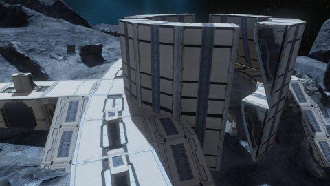
The central tower of Hekau is an example of where the numerous fine lines and powder blue bars were aligned with each other to make them look like the intended exterior paint job on the building itself. Maintaining the alignment in such a way that they look reasonable added to the beauty of the map. I didn’t like the visual noise that the sides of the stunt ramp offered, but the stunt ramp provided decent Geometry and the skins on the top and bottom were extremely helpful in creating a subtle Architectural appearance.
In one of my Erosion maps, which I consider to have the most beautiful skins I have ever seen, I merged the 2x3s with 2x4s where their common skin imagery blended. This allowed me to create curved ramps as underpasses to other curved ramps, creating a crafted look rather than forged look.
Notice how I was able to use the direction of the lines, both the fat bars and thin lines, to show predominate direction of travel across the structure. I wasn’t happy with some of the skins’ patterns, but I was able to leverage them very effectively by forming a pattern as part of the Architecture itself.
Blindness
When Halo 4 came out, the blocks in the forge Canvases Ravine were horrendously noisy. The publisher responded to our complaining about visual noise (directly or indirectly, we really have no idea which) by giving us a detail blind palette in Forge Island. What do I mean by detail blind?When you look at the skins of two blocks on Ravine, chances are you will see blushes of rust here and there. Take those two blocks and merge them together and you can see the corner of their merge by how the rust abruptly ends along the edge of the corner. Even if there was no rust, rather just a flat color, you could still easily see the corner edge of their intersection by how the colors of the two surfaces were slightly different. This in fact has always been the case even with every Canvas palettes on Reach.
But Halo 4’s Forge Island introduced a new concept, Blindness, where the corner of the intersection of two blocks simply disappeared from view. It isn’t clear why this happens. It could be a byproduct of the publishers’ attempts to reduce visual noise. And it happens typically only in the shadows of interior spaces where the detail is lost to blending with shadow.
This blindness is more of a distraction than visual noise ever could be, and for a very similar reason – it requires the player to concentrate on what they are looking at to understand what they are looking at. It is a huge distraction to the player.
If the environment you are forging includes blindness of edges and details, you want to make sure that no where does the blindness manifest itself.
Striking Features
All of this discussion on visual noise should not be confused with striking features of Architecture. Bold, thick, solid patterns on a skin repeated across a structure can be used to enhance a strong Architectural Theme. For example, the large black pattern repeated across the wall in Hekau doesn’t stick out as noise, but as a bold Architectural feature.
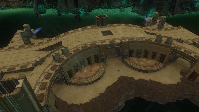
Consider the next picture of the same Erosion map from above, in which the interior of the center structure leveraged the copper band at a singular height from the floor to give a solid Architecture. By maintaining a solid and consistent width through out the interior, the band becomes a striking Architectural feature rather than noise.
This is not the same as hopelessly aimless lines that go no where and thus have no real purpose other than the forger cannot get rid of them. And in many cases you don’t want Architecture void of contrasting elements. You just want the contrasting elements to contribute to the Architecture and never be a distraction.
Summary
Visual noise is a distraction to players, most notably because it requires the player to concentrate on the noise and understand what it is he is looking at.Visual noise breaks cohesion of the Architecture and breaks immersion across the board. In some cases you might be able to use it, but usually it is just noise.
Blindness is worse than visual noise, because instead of trying to understand what you are looking at, you are trying to see what it is that you are looking at.
As a forger, you should avoid both extremes, and don’t be afraid to experiment with striking Architectural features.
No comments:
Post a Comment
Note: Only a member of this blog may post a comment.