Saturday, August 30, 2014
Welcome to Forging Halo
Forging for the Playlists * Terms & Acronyms
Chapter 1: Geometry
Spaces, Walkways, and Paths * Flanking * Orientation * Segmentation * Elevation * Paths To Power * Structure * Approaches * Symmetry * Traffic Patterns * The Correct Questions * Foreshadowing * Pace * Less is More * Power Weapons * Vehicles
Chapter 2: Art
Aesthetics, Art, & Architecture * Immersion * Visual Noise * Visual Cues * Colors & Contrast * Ambiance * Cohesion * Theme
Chapter 3: Depth
Power Weapons * Vehicles * Map Control * Leveraging Meta * Dual Objectives In Invasion * Static Spawning
About Forging Halo
Wednesday, August 20, 2014
About Forging Halo
Forging Reach was started to share with the community my aggregating all of the official Bungie information (JonnyOThan’s sketchy tutorials and his answers to our questions) on the spawn system and present them in comprehensive and easy to follow articles. Over time, the blog expanded to include other topics. And I finished the blog with a lengthy series of mini articles on forging for the Invasion playlist.
Forging Halo 4 started with unofficial information on the spawn engine because 343i and Certain Affinity never provided a forum and an inside source to answer our questions. Tiberius Audley provided the first analysis and discussion on how to make the spawn system work for you. Simple as it was, it started me down a road to go to the next level of discovery and discussion, and I wrote a number of articles on the deficiencies of the spawn engine and how to make it work as best we can. It was at this point I became interested in writing about generic level design concepts that were important to forging Halo maps. I felt that they should not be tied to Forging Halo 4, since they could be used for future titles as well.
Forging Halo is yet again a completely different approach. For the articles on this blog, I lean on concepts that some of my friends had taught me one on one in forge, from reading articles at various forums, and from listening to people in lobbies and in games over the years. It is my intention to simply capture all of this information into a series of articles with great detail and deep analysis, to help the aspiring Halo forger skip the learning curve that I had endured, and to reach the next level quickly.
I have read many articles on the web about forging for Halo and also about level design in general. What I hope to bring to the table is a fresh explanation behind the why? regarding what to forge into a map, and to present the information in a comprehensive and analytical perspective. I hope that you can find these lessons helpful.
- MrGreenWithAGun
Static Spawning
Rewarding Skilled Pushes
As I mentioned in the lesson on Symmetry, Static Spawning – teams spawning only on their side of the map – is only required for those Game Types that have objective goals tied to team bases. But there is a case for including it in most other Game Types.Dynamic Spawning – teams spawning in the safest location anywhere on a map – provides for safer spawning above all else. The intention is to allow players to spawn as far from the enemy as possible. For example, if blue team overruns red team’s base, then red team would spawn at blue team’s base. This approach simply makes spawning safer.
But a side affect of Dynamic Spawning, especially for Slayer, is the counter intuitive rewarding of the team that is being overrun. Out skilled by the blue team (for example), the red team will be pushed back against their end of the map until suddenly they begin to spawn behind the blue team. The spawn engine suddenly begins to reward the red team with the ability to flank the blue team from behind. This reward is counter intuitive, as it rewards the less skilled team and penalizes the more skilled team for being aggressive.
The consequences are severe for the blue team. They can feel pressured not to overrun the red team’s base – their movement becomes deprived. This is no small issue that you need to consider.
But there are those who feel that if the teams are so unbalanced that the red team would wind up spawning behind the blue team, then it would be better than having the blue team crush the red team. I would disagree with this, but it is open to opinion on how a Game Type should play out.
Dynamic Spawning
I used to think that Spawn Traps were bad, bad, bad. But I read a post somewhere in which someone advocated that Spawn Traps could create a healthy meta game in some cases. But what was really surprising was that he went on to say that Spawn Traps in a Dynamic Spawning experience was where real skill shined. (The discussion revolved around an Arena style map.)I can imagine.
It would take real skill to Spawn Trap when a small change in your position can force a player to spawn behind you. Or in the case of Reach, just killing them on one end of the map causes them to spawn behind you on the other end.
The point of this is two fold. Firstly, Spawn Traps, when done correctly, can be considered a meta game – forging the ability to prosecute Spawn Traps under very carefully executed procedures is forging depth into your map. On the other hand, making it easy to prosecute a spawn trap is ridiculous.
Second, the skill gap is increased if you allow Dynamic Spawning on the map that allows for Spawn Traps from a single Power Position (for example) so that a team can drive the trap and then prosecute it through carefully played out strategies.
Summary
Static Spawning rewards skilled teams that push the other team back against their base. But this type of Game Play may be considered too brutal or unbalancing.Dynamic Spawning rewards higher skilled players on some maps that allow them to drive and then prosecute Spawn Traps all around them.
You should be aware of the depth each of these adds and decide if your map should include either to increase the fun and the skill gap on your map.
Dual Objectives In Invasion
The two Objectives are forged close enough to each other that a defender can move from one to the other in time to interfere with an offensive push. However, they are far enough away that he cannot defend both at the same time.
A feature of the Game Type ensures that when an offensive push is repelled, the Objectives return to a minimum amount of time to capture – their Float Time – so that this decision remains credible. The purpose of the Float Time is to avoid the scenario where one Objective has just a couple seconds left, leaving the defenders with no choice but to remain and defend that Objective.
This Float Time determines how far the two Objectives can be forged from each other. If the Objectives are too far apart, then the decision to abandon one Objective to save the other is no longer a credible decision.
Not only does forging the two Objectives just within the Float Time apart from each other make the decision to abandon one Objective to save the other credible, it also offers the decision to defenders without any time to think through the consequences. It is this type of decision where there is no real time to think that makes Invasion interesting, where the invaders can trick the defenders into making a game breaking decision. It is this type of forging that adds a tremendous amount of depth to an Invasion map.
Invasion makes a great case study on forging depth into a map, though I doubt we will ever see a Game Type on the same level of complexity again. Nonetheless, I include it here to add to the breadth of this discussion.
Summary
Invasion is a Game Type that required specific features forged into your map that naturally provides quite a bit of depth.The more intense types of decisions are those that are game breakers for which players have no time to think through the consequences.
Leveraging Meta
Halo Is Full Of Meta
I had always known that meta was short for meta game, and that meta game simply meant a game within the game. Everything I talked about thus far in this chapter on Depth can be summarized as adding meta to your map – adding a game within the game when the game is played on your map. But when I asked at Beyond Entertainment what they felt the term meta meant, I was surprised how abstract they took the term.[1]Halo has meta in it. You simply leverage it in your map. Power Weapons – meta. Vehicles – meta. Jumping ability – meta (you can create trick jumps that make the game play differently, advantageously, etc.).
Not all meta is good for the game. Take sprint and jet pack for example.
Learning to leverage the meta that is there will help your map become more interesting. I want to take a look at just two. In the first case, dropping the flag, is title specific – Halo 4 lacked this meta. In the second case, jumping, all titles have this, though the height varies from title to title. But they can all result in trick jumps that players discover and utilize to their advantage.
Drop The Flag
If you can drop the flag, you can drop it through a window (throw it) where a teammate is waiting to take it. Isolation on Halo 3 was an example where you could throw the flag out the window of one base, take a short walk to the other side of the tunnel between the two bases, and throw it through the window of the other base to capture the flag. Isolation’s design of having its front doors face away from each other while their back windows face toward each other leverages this particular meta in Halo 3. Isolation’s design makes throwing the flag through the window extremely advantageous, because it bypasses any setup that the defenders may be creating near their front door, and it cuts the trek, the time, and the effort to capture the flag substantially less.Trick Jumps
There are many examples of trick jumps, or tac jumps (tactical jumps), found on any map. Some are intentionally forged into the map, but quite often many are found over time by adventurous players. You should intend to provide a few trick jumps to make your map interesting to play on. Some players just love trick jumps. But realize there are going to be some that you never saw until others demonstrate them.Trick jumps are a product of jumping itself. Unlike most other FPS games, jumping in Halo yields a much higher than normal jump. Each title is different, so you need to experiment and see how hard each trick jump will be.
By adding trick jumps to your map, you increase the skill gap. But be sure you make jumps that are readily performed by seasoned players. Trick jumps should not be hit and miss – they shouldn’t be border line in success when done right.
Summary
You can leverage game meta in your map to make your map more interesting.Some meta is title specific and some is across all titles. So you want to get familiar with the title you are forging for and see how you can leverage its particular meta.
Leveraging meta should result in advantages, such as faster movement to a higher location, faster movement of the flag, etc.
_____________________
[1] Defining Meta @ Beyond Entertainment, a collection of feedback worth reading through
Map Control
Manipulating Enemy Movement
The right Power Position overseeing adequate areas of the map allow a player in that position to influence how their adversaries will move about. They can do this by suppression fire where they do not want their adversaries to move through, forcing them to find alternate Paths. This can be used to a team’s advantage, and can turn a Slayer game into a game of manipulating one’s adversaries. The focus changes from Slaying to manipulating. The goal would be to utilize this advantage to achieve the primary objective (killing the adversary in Slayer). It could also be to lengthen the adversaries’ Path to a KOTH Hill, for example.The point is that Power Positions can be used in various ways, and can open up Meta Games that others discover later as they work to find advantages over their adversaries through many games over time. And while I talk about Geometry influencing movement, I am certain there are other Meta that Geometry can introduce that I am not even aware of. But this example should get you started in realizing how Geometry can create Meta even in potentially unsuspecting ways.
Baiting Power Positions
Now I want to take the idea a step further and discuss how one Power Position can be used to over look another Power Position, yet not be the Super Position.Take a map in which there are three levels, level 1, the ground level; level 3, the high ground; and level 2, an intermediate level. Now create the Geometry necessary to allow level 2 to overlook level 1; and the Geometry to allow level 3 to overlook level 2; and finally the Geometry to prevent level 3 from having any sight lines on level 1. The result is level 3 influencing level 2, and level 2 influencing level 1.
Now put something important, say a Power Weapon, at the bottom of level 1. You now create the scenario where players on level 2 can use the Power Weapon as bait. But wait! Level 2 now is bait for level 3!
Do you see how this can increase the depth of your map? Do you see how players on either team can play levels 2 and 3 in a constantly dynamic changing strategy through out the match?
Influencing Spawns
Many of us have heard how in Halo 2 one could stand at very specific locations to help their team mates spawn in very advantageous locations on the map. The Spawn Engine for Halo 2 made this possible.On the other hand, you can also influence the spawning of your adversary. For example, in Halo 4, in CTF games, one could stand in the enemy base and force the adversary to spawn far away from their base. The difficult part was sneaking into their base.
To understand how any of this happens, either someone must discover it in game, or someone must analyze the map’s Spawn Layout in forge. In each case, manipulating spawns on a map, either your own teams’ or those of your adversaries’, become Meta Games in and of themselves. They are strategies, conscious decisions on the part of players, to pull them off for the purpose of achieving an advantage in Game Play.
Prosecuting Spawn Traps
Another favorite Meta Game that some maps lend to is setting up and prosecuting Spawn Traps, or even Spawn Kills in the open. In this sort of Meta Game, a team carefully shuts down their adversaries’ spawn points so that they only have one place to spawn on the map. When they come out from the cover, they are exposed to fire from multiple angles.This particular Meta Game may be considered too rough for most playlists, but it is something to consider. If you implement this in any way, make sure there is at least one way to break the trap.
Finally, Spawn Traps collapse in Reach, but heavily sustain themselves in Halo 4.[1] I mention this to point out you should learn how the Spawn Engine of the title you are forging for behaves to fully understand how to forge a Spawn Trap (or how to ensure one cannot occur).
Summary
Like Power Weapons and Vehicles, the Geometry and the Spawn Layout can also create Meta within your map.Geometry can help create a Meta Game of manipulating movement to gain advantages, and can result in some interesting Game Play.
Geometry and Spawn Layout together can create a Meta Game of manipulating spawns for either team.
And you could, to the degree that the title you are forging for enables, add Spawn Traps as an additional Meta Game to your map.
______________________
[1] Understanding Why Spawn Traps Exist
Vehicles
Remember that depth is introduced when players are confronted with decisions to focus on objectives like Power Weapons instead of the primary objective of the game, and for the purpose of gaining advantages over their adversaries. Like Power Weapons, the more powerful the vehicle, the more important it becomes to winning the match.
Forging a Scorpion, a Wraith, or a Mantis can lead a player to make the decision should they jump in the vehicle and remain back, should they push forward, or should they not even bother with the vehicle at all? And if the vehicle is a very powerful weapon system with no real threat save the laser (as in Halo 3 Sand Trap or Valhalla), then the value of acquiring the vehicle becomes enormous (particularly the Scorpion). This last part in turn makes jacking the enemy Scorpion, Wraith, or Mantis all that much more valuable. From this value the meta game of jacking the enemy vehicle becomes a priority amongst a good segment of the population.
For me there was never any more satisfaction of jacking the enemy Banshee and successfully flying off with it on Valhala, the Scorpion on Valhala Heavy or Sand Trap Heavy, or the Gausshog or Banshee on Standoff Heavy. Those were the ultimate statement of dominance over my enemy – that I could slip in behind their lines and take a very important commodity from under their noses and turn it on them. And honestly even if they stopped me cold in my tracks, there was still an enormous satisfaction of having denied them their prize. I valued the success of this meta game way more than whether we won the game itself, because of the personal challenge it presented to me to do the unusual, the unexpected, the ultimate in surprise. The depth that this type of meta game offered was enormous.
Summary
Vehicles can offer Meta for your map just as Power Weapons can.If both teams have the same vehicles, then jacking the enemy’s vehicles and denying them an equal advantage becomes a sport in and of itself.
The more powerful the vehicle, the more incentive there is to acquire the vehicle, or at least denying the enemy the same.
Power Weapons
Secondary Objectives
A Must Have Power Weapon typically creates a secondary objective in any game, offering players decisions regarding the acquisition of the Power Weapon, thus forming the basis of a meta game. To better understand this, let’s explore the importance of acquiring rockets to achieve a significant advantage over one’s adversaries.Rockets are so important that the knowledgeable players will learn the location and timing rules of the rockets’ spawn and work to control that section of the map whenever the rockets are scheduled to spawn. This strategy of controlling rockets becomes another game within the main game. Attention on the main game is temporarily put off to the side while the rockets are being acquired.
While the primary objective of Slayer is killing, and the primary objective of CTF is capturing the flag, the secondary objective of the meta game introduced by the rockets is acquiring the rockets themselves. And while the primary objective adds score, the secondary objective adds advantages within the Game Play itself. So much do rockets add advantage that they can in some cases become necessary to winning the match itself.
The Advantage
Adding a Power Weapon could be used as incentive to draw a player from a power position. Should they abandon one advantage for another? Should they remain back and risk losing what advantage they have to the Power Weapon? Or even use the Power Weapon as bait to pick off adversaries trying to acquire them?Forcing the player to make a decision enhances the Game Play, adding additional strategies that would not exist without the Power Weapon, all the while not altering the Game Play at any fundamental level. Forcing them to think beyond the most basic of instinct of aiming and shooting makes your map interesting.
Better Map Usage
Snipers are a good example of giving players a weapon that can best be used by specialized areas of the map – areas that are further from most fire fights and thus more out of range, but work well for the Sniper. These areas of the map may tend not to be used much during most of the Game Play, but can be very useful if one has a Sniper.You can include one Sniper on each side of a map near each team’s base where one can then move to an ideal sniper position that is also way out of position to be much help if the action goes to another area of the map. This kind of game breaking decision is exactly the kind of decision you want to temp your players with.
Stripping Depth Away
Consider the Halo 3 Rockets that spawns in the center of the map. A team will note when the rockets are picked up and used and begin to count to the next spawn. Before the next spawn they try to take control of the spawn area. The meta game is that of knowing where and when the rockets will spawn. All of these things a player is conscious of, because he can improve his Game Play by being aware of them.Now consider the Halo 4 model of ordnance drop. The player cannot know where or when or even what weapon will spawn, because all of that was randomized. Having nothing to think about regarding the Power Weapons, he is left with only thinking about the primary objective. This elimination of decision making and the predictability necessary to form intelligent decisions makes the game shallow.
When confronted with this dilemma, some forgers simply chose not to forge ordnance drops onto their map, or at least not the random variety. The initial ordnance drop timer was fixed by the publisher and acted much the same way as the Halo 3 weapon spawn, except that it presented a way point indicator when a weapon became available (from spawn to acquisition).
Summary
Power Weapons are one way to offer players decisions by giving them secondary objectives to acquire, forming a game within the game.Power Weapons should enhance the Game Play on your map, never alter the Game Play in a radical way.
Adding depth makes your map more interesting to play on and increases the life of enjoyment your map has to offer. Shallowing the map can reduce the Game Play to simply killing your adversaries, which will get old real fast.
Chapter 3: Depth
If you make a simple map and play Slayer on it, you will get bored after a short while, because all you do is run around trying to kill your adversary. That sort of Game Play doesn’t take a lot of thinking on anyone’s part. You just run around until you find someone, aim, and shoot. That is a shallow map.
It is when you add features to your map that offer – or even force – players to make decisions that you are adding depth to your map. You are making the Game Play on your map go beyond the basics of focusing on the primary objective itself (killing for Slayer, the flag for CTF, etc). You are giving players more to think about, more choices to make, more strategies to employ, all of which are to achieve advantages so that they can win the match. Choices make your map interesting, which translates to fun.
In this chapter I want to discuss various ways you can forge depth into your map. I want to talk about using Power Weapons, vehicles, Geometry, and Spawn Layout. But keep in mind these are just a short list of samples. Ultimately the breadth of this topic is well beyond the scope of this blog and well beyond my imagination. I only want to give enough breadth of ideas to get you started and to get you to see how limitless the possibilities can be.
Theme
Why Theme?
When a player looks at your map, what do they see?Exactly…
Either your map will have a strong Theme, or your map will be nothing other than a pile of blocks.
As I mentioned earlier, I learned some techniques about how to bend perception by exaggerating features to help the player see what you want them to see, because you cannot forge what you want to forge correctly. My first map, Flight Deck, was my first attempt at this, and I thought an aircraft carrier was a great Theme to forge.
But Affinity[1] showed me how limited bending perception actually was, and how important it would be to leverage the Theme of the Canvas’ palettes. I don’t mean that bending perception was limited in the sense that you can only apply those techniques so many ways. What I mean is that at the macro level, or at a rough draft sort of way, you cannot draw a player deep into the Theme when there are details on the skins of the blocks that don’t support your Theme.
Looking at Affinity’s tall columns with fine and accurate etchings across their pristine surfaces shouted forerunner. If you want to make a Halo map for the playlists, you can’t do better than a forerunner Theme.
Leverage The Palette
Well, the truth is, you can’t do better than the Theme of the Canvas’ palettes. This is because the fine details of the skins add to your Theme – or take away from your Theme – in ways that nothing else will. The details, the etchings, the colors, the cohesion of these elements across the Palette, they all add to the total cohesion of your Theme, your Architecture, your Artistic works on your map in ways that tie everything together.The fine etchings on the surface of the blocks will detail your map for you. But this implies that you need to do the heavy lifting of creating the bulk of the map’s Theme in structural design – how the structures are laid out, the blue prints of the buildings, etc. You can only rely upon the skins of the blocks to bring the Architecture alive to the players by giving the surfaces of the structures the final touch to the Theme that you forged the structure only so long as the two Themes are one in the same.
So What Do You See?
Take a Forge World 1×4, merge it into the ground a little, put some small rocks in a ring around it, and what do you see?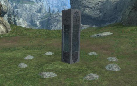
Forerunner.
That is the Theme of your map, as simple as it may be. Do you see how you can Forge a Theme without effort? Do you see how when you keep your map simple the Theme in the palette is leveraged more as the visual cues to the players what the map’s Theme is suppose to be? Do you see how you make the skins carry your theme when you keep the structures simple?
This is yet another example of Less Is More. Don’t be afraid of using too few blocks that your Theme will be missed. Be afraid of using too many blocks that your Theme will be hidden in the confusion and clutter. Don’t be afraid of relying upon the skins of the blocks to carry your Theme. Be afraid of creating a Theme that contradicts that of the palette.
Summary
Maps without Themes are just piles of blocks.Create maps with Themes based upon the Themes of the palette of the Canvas you are forging on. The palette’s Theme can bring your map alive.
Don’t over forge the Theme, but rather let the block skins present the Theme for you.
______________________________
[1] Affinity, Halo: Reach, by Godly Perfection
Cohesion
When I discuss cohesion, I usually refer to the cohesion of the Architectural Theme or the Architectural design, because that is where forgers tend to have the greatest difficulty in bringing forth strong cohesion. Either they have none, or their Architecture is missing it here or there and thus it simply breaks down.
There are a number of factors that can break cohesion of a map’s Architecture. I will try to list some of them here, but by no means are these the only ones.
Visual Noise
No map can sustain cohesion in any sense of the word if there is visual noise. Visual noise is where you look and see lot of colors, contrast, and patterns that don’t create any kind of unity in Architecture. Halo 4’s palettes are notorious for blocks’ skins that contribute heavily to visual noise.Consider the types of blocks that you use to build a single structure. Do they look like they go together? Do they look like they form a cohesive structural feature? This is the most difficult part right here, so let me say it again. Do the pieces that make a structure look like they work with each other? Or do they clash with each other, creating visual noise?
Clashing Architecture
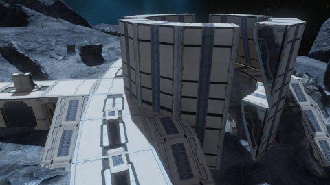
Consider two structures that have distinct Architectures, yet they are sitting next to each other, or facing each other. If they look vastly different, they clash. Consider the types of blocks that they use in their construction. How would one structure made up of Brace Larges look compare to another sitting next to it made of 4×4 talls?The following picture shows a collection of experimental Architecture that I was developing to see what I would be able to use effectively. Notice how they clash with each other due to their Geometries and skins.
Consider every publisher map you have ever played on. There are very few that have varying Architectural features through out the map (e.g., Powerhouse). Typically, the Architectural features are common everywhere you go. Consider the white walls and balconies of Boardwalk, the redwood flooring and walls through out Reflection, the grey steal structures through out Countdown, the grassy hills of Valhalla and the two silver grey forerunner structures at either end, the sand dunes and rock structures through out Sand Trap, the green quarts/metallic through out Guardian, the violet alien gentle curved structures through out Assembly and Zealot, the grey slate slanted walls through out Sword Base, the circular structures throughout Spire. Geometry helps maintain cohesion through out the map by bringing unity of Architecture.
Bringing Cohesion To Your Map
If one structure in your map is circular, make them all circular (Hekau). If one is elongated rectangular, make them all like that (Boardwalk, Sword Base, Reflection). If one is tall and narrow, try to make them all similar in ratio of height to width (Orbital, Narrows, Valhalla). If one is elevated off the ground, try to make them all elevated in the same way, but perhaps a little different elevation for each so that they are not on the same plane (Boneyard). If one is boxy, try to make everything about your map boxy (The Pit).If your map has a weenie in the center, then try to make the rest of the map similar in elevation according to their distance from the weenie (Spire, Zealot). If your map is an asymmetrical map, consider a steady change in elevation from one end to the other (High Ground, Powerhouse, Zanzibar).
Try to make the doorways look the same through out. This makes the cohesion of the structures even stronger, because the doorways are a key element that players focus on, and they will see how the doors differ even the slightest. This doesn’t mean that the doors have to be the same exact dimensions, but that they look like they were constructed with similar architecture with similar materials for trim, walls, etc.
Leverage the natural terrain and make the structures you forge on the terrain match the terrain in the context of the Theme you are trying to forge into your map. And when I say Theme, it can be abstract Art for all I care. It just needs to be clear what you are trying to do so that they player isn’t scratching his head trying to figure out what you intended.
Keep It Simple
Like the phrase, Less Is More, just keep your Architecture simple. It does no good to make a complicated Architecture that is heavy in details. You should just make the basic structure look good, not complicated.By keeping it simple through out, the simplicity of the Architecture will form a strong cohesion of visual Art that people can enjoy. And remember to keep it The same simple Architecture through out!
Don’t use blocks with angles at one end and blocks with completely different angles in the middle. Since they can both appear in the same perspective of view by a player, they will more likely clash. If you want a specific Architectural structural concept repeated, make it the only one through out your map (Epitaph’ walls, Reflection;s walls, Sword Base’s walls, Sand Trap’s temples, Countdown’s central balconies, Boardwalk’s walls).
Summary
Keep the structure’s building materials simple and cohesive – do the blocks work with each other?Keep the structures of the same Architecture – do they look like they were made out of the same factory?
Use the same approach for everything at the macro level – same design features, same materials and building blocks, same repeating patterns in structural features, etc.
When it comes to cohesion, the key is consistency through out every aspect and dimension of your map.
Ambiance
Brightness
One predominant feature of all Reach maps were their bright Ambiance. They were all tuned to afternoon sunny skies. Halo 3 has a few dark maps, such as Sandbox, Guardian, Orbital, and Blackout; but otherwise were also predominantly sunny skies or bright interior Ambiance. It wasn’t until Halo 4 that the majority of maps were dark, hazy, or in some way obscured. (ODST had mostly dark in the campaign, but we are focused here on multiplayer.)Brightness is key to a player’s speed of movement. Snipers is best played in massive open terrain or dark ambiance. (The Sniper playlists have always played like SWAT, never like a true sniper Game Type.) The darker the map the slower the player tends to move. This is basic psychology of FPS. I have always wondered why the publishers of Halo 4 turned the maps somewhat dark. They aren’t dark enough to retard movement but they are dark enough to ruin the feel of energetic movement.
This is also why Active Camo is a key component to Halo. There are some players that love the slow,stealth Game Play you get in dark maps. Active Camo leverages Halo’s sci-fi Theme to compensates for the bright Ambiance. In my opinion this compensation works best when it is a scarce resource on the map, implying Active Camo in loadouts is too much and clashes with the bright Ambiance.
Why does a limited resource of Active Camo not clash, but unlimited Active Camo does? Because a limited resource becomes a specialty; but unlimited brings into question if the Ambiance was properly chosen in the first place. In other words, it is okay to deviate from the map as a specialist. But it clashes with the map when the Game Play is heavily counter to the maps’ original design. A specialist brings depth to the map and makes it interesting. Over use of Active Camo breaks the map and distracts from (or even shallows) what depth it could bring to the map.
Purpose
The purpose of Ambiance is to establish an atmosphere, an emotion within players, and to help immerse players into the Theme of your map. For this reason a special effect must support your map rather than usurp it. In other words, your map should provide pretty much the same Aesthetics (emotions and beauty) without the special effects; while the use of the special effect simply seals the deal and drives the Aesthetics home.Special Effects
Canvas palettes typically include a selection of forge objects that when instantiated immediately apply their effect upon the video being rendered. Some darken the screen by applying a dark color, such as purple. While you can approximate night sky with some of these effects, I haven’t seen a true night sky effect that comes anywhere near the quality of natural dark we saw on Blackout.However, if you need to make a black and white Ambiance (with natural greys through out) there is usually such an effect available. These work good for Living Dead maps (zombies or flood), because they help immerse players into a mindset of an old horror film. But for any other Game Type you want to leverage the natural Ambiance. Very rarely does any special effects work for any other Game Type.
Summary
Bright Ambiance sets an energetic feel of fast movement, while dark Ambiance promotes slow movement.Active Camo compensates Halo’s tendencies for bright Ambiance to allow for slow stealth movement one typically finds on dark maps.
Special effects allow you to manipulate the Ambiance, but its use should support the Theme of the map, never usurp the map.
Black and white special effects are sometimes used to promote the horror film Aesthetics of Living Dead maps; otherwise all other Game Types are best served promoting the natural Ambiance of the Canvas the map is forged on.
Colors & Contrast
Contrast In Color
Colors of similar hues don’t contrast with each other – they don’t clash. But colors of opposite hues do. Take a purple weapon and sit it on a yellow table. It sticks out because the purple is at the opposite end of the color wheel from the yellow.Now take that same purple weapon and place it on a blue or red table. It stands out far less. It blends in more. This is why the purple leaves on Boardwalk work so well as soft cover – both red and blue teams blend equally well behind the purple leaves, and both are just a little noticeable behind the purple leaves.
Understanding the color wheel can help you understand how to maximize or minimize contrast for various colors.
The Purpose Of Contrast
Contrast is used in level design to attract or grab a player’s attention to something important. It can be used to draw a player’s attention to a power weapon or some important pickup. It could also be used in a similar manner to draw a player’s attention to an open doorway, as a visual cue to where they player should go next. The former is used through out level design, the latter is used for campaign mode rather than multiplayer mode.Where there is contrast, there is attention grabbing. Where there is no contrast, there is a lack of attention grabbing. Those areas that lack contrast do not compete for the attention of the player. Therefore, most of the map should lack contrast. This is why visual noise in Architecture needs to be well controlled or it can wind up inadvertently competing for the attention of the player where it should not.
Contrast can occur either through variation of intensity or variation of color. For example, a black weapon on a white table is an example of contrast of intensity, and a purple weapon on a yellow table is an example of a contrast of color.
Managing Contrast
Since contrast should be avoided everywhere except where you want to draw the player’s attention, you want to avoid contrast through out most of your map. However, this doesn’t mean that the ceiling should be the same color and texture as the walls or the walls the same as the floor. This is exactly the problem with Halo 4’s Forge Island Blindness that is created in the shadows when the ceiling, walls, and floor are all the same color.You really want the surfaces to differentiate from each other so that when a player looks into a room they can immediately perceive the walls from the floor and the ceiling. But at the same time you don’t want this contrast to be significant enough to be grabbing the player’s attention. You want the differences to be subtle, such as the same hue of color, but a different shade or saturation; or just a slightly different hue.
A more natural approach is to use a flooring material that looks like flooring, a ceiling material that looks like ceiling, and wall material that won’t class with either. Of course, this is dependent upon the palette.
Once you establish the bulk of your map’s contrast level, you then know how much to raise the contrast level to grab the player’s attention. Hopefully the level through out most of your map is very low in contrast – you wouldn’t need to go to extremes to grab a player’s attention when you need to.
Summary
Colors can contrast as well as blend, you just need to decide what you want to achieve and with which colors.Contrast can be from colors or from intensity.
Contrast is used to grab a player’s attention.
You need to minimize the contrast levels through out your map so that they don’t compete for the player’s attention.
Visual Cues
Navigational Aids
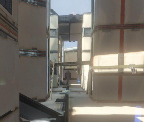
Some visual cues are used to help players understand how to navigate your map with less effort on their part. In level design practice, lights shining through a doorway help you see that there is a doorway down the hall even if you cannot see the doorway itself. The light also acts as a means to attract you to the doorway, a way to help you know where to go next. In Halo, lights tend to bleed through the walls, so instead of using lights, you might try using a change in the pattern of the flooring that alerts a player that there is a new Path opening to take.This is very important for long Walkways where you can see the far end but not necessarily any side openings due to the Architectural features. If you have a repeating pattern of struts protruding from the structure along one side of the Walkway, and between two of them you have a doorway hidden behind the struts, you want to give the player standing at either end some indication of the door’s presence so they can evaluate the risks and their options more correctly. You can do this by some visual cue in the flooring or above the doorway itself. The point is you don’t want to hide the doorway in a pattern, but instead draw attention to it through a subtle cue.
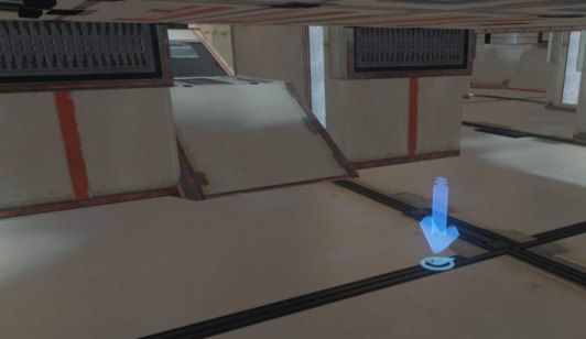
In level design practice, when you want a player to move along a Path in a field, you cut the Path out using sand, dirt, or pebbles. People will see the Path cut through the grass and naturally think that they need to follow the Path to get somewhere they should go to. Until Halo forge evolves into a full terrain editor, the lines and patters on the skins of the blocks are a good substitute. The lines or patterns on a block’s surface can be aligned to the predominate Path that runs over that block, to aid the player in understanding that there is something in that direction, or that the intent is for them to move in that direction.
Beacons
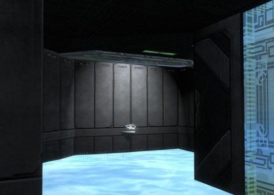
You could use visual cues to point players to power weapons, or other valuable pick ups on your map. This is where light can be useful if used carefully. Light, such as the animated light of a receiver teleport, can be used to grab a player’s attention and draw them to the power weapon. I used this technique in Reach, where the energy sword appeared to spawn out of the white flame from the floor. It gave a visual cue that would grab the player’s attention, and gave the spawning of the sword a reasonable context (e.g., the sword didn’t just spawn in thin air).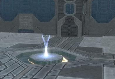
I have seen some other examples of how light is used to show case a weapon in a dark room.
However, if you use a weapon spawning system (depends upon the title you are forging for), your weapon may have a way point indicator that simply draws the attention of the players for you. We will talk more in depth about the way point indicators for weapons later.
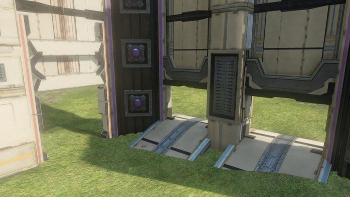
We can also see examples of how the Publisher uses light as visual cues in teleports, grav lifts, and man cannons. Each uses a bright light, and each adds to the attraction by animating their light. In the case of the grav lifts and man cannons, the animation of the light is also a visual cue as to the direction of travel. In the case of the teleport, the light at the sender node is quite different than at the receiver node to offer the visual cue that it can send. And the visual cue of the complete absence of light indicates an incomplete teleport channel configuration.
Map Boundaries
Safe Boundaries define where the play area exists on the map. Kill Boundaries define where off limit areas are at. But these boundaries are invisible to the players.Quite often a map is bound by the walls and even a ceiling. In those cases, the walls and ceilings act as obvious boundaries to the map. But what if the map doesn’t have a fully enclosed boundary? What if there are no walls or a few walls? How would the players know the boundaries of the play area?
This is where you want to use some sort of visual cue, a boundary marker, to suggest to the players that the marker is a boundary to the play area. There are two features that would clue the player that they are looking at a boundary marker, regardless what you use (you could use a pole, a rock, a small block, etc., whatever looks good with your map’s Architecture and Theme).
Firstly, the marker will look purposefully planted, yet not a real part of the playable area – it will look like a boundary marker. You should try to make the marker look as natural and reasonably expected on your map as you can. But there are simply cases where you will be signalling so strongly the edge of the map that it will have some effect on the player realizing they are on a map. This mini break in immersion can be mitigated by making the boundary look as natural to the surroundings as possible – like they really are in no way out of place at all.
Second, there is nothing beyond the markers. The biggest clue that they are looking at the marker is that the marker itself represents the outer most forged object on the map. A fence, a string of rocks, things that stretch and can rise no more than chest high can serve as a marker, because when they look over or around it, they see nothing else.
Additionally, you want to use the flavor of boundary that allows them to step past the marker and into an out of bounds warning zone. The other flavor is an instant death zone, but those are never to be used to indicate out of bounds. Their only purpose is to speed up the spawn cycle, and are properly used exclusively when a player falls so low below the map that they cannot return to it. Typically entering into one of these sudden death zones is accompanied with the caption or voice track, You fell to your death.
Consistency Is The Key
Visual cues are readily discerned from a distance so long as they remain consistent across your map. For example, visual cues indicating doorways should always be used in the same way. What appears as a visual cue for a doorway in one end of the map should not be used for any other purpose anywhere else.Bending Perception
I wrote an article, Forging An Illusion, in which I talk about how one needs to bend perception by exaggerating features so that players see what you want them to see, even though you really can’t forge it correctly. Visual cues can be forged that stand out and grab a player’s attention to see in your forge work what you want them to see. This entire concept is heavily artistic and I really don’t want to get into the subject here, other than to say that what you forge in the way of visual cues can help draw your players into a Theme more effectively.Summary
Visual cues can help players learn to navigate your map faster, and the spawn locations of weapons.They can also help identify the boundaries of your map.
You can even use visual cues to bend the players’ perception into seeing Themes you want them to see that can help them immerse into your map.
Visual Noise
Visual noise is noise within the visual perspective of the player.
In this lessons I hope to discuss the concept of visual noise so that
you can readily identify it in your own maps. I hope to also discuss how
it impacts the Game Play in negative ways.
To better understand what visual noise is, we could ask how it is introduced into a map.
Visual noise is created by things like thin lines of extreme contrast to their background that serve no purpose – like graffiti on a wall. Only they are worse than graffiti because they are not graffiti. Contrasts in fine detail can yield visual noise unless the fine detail looks like it belongs there. In most of the Canvases of Halo 4, you see fine lines that move along in all directions and you won’t be able to make them look like any of them are intended or were meant to be there.
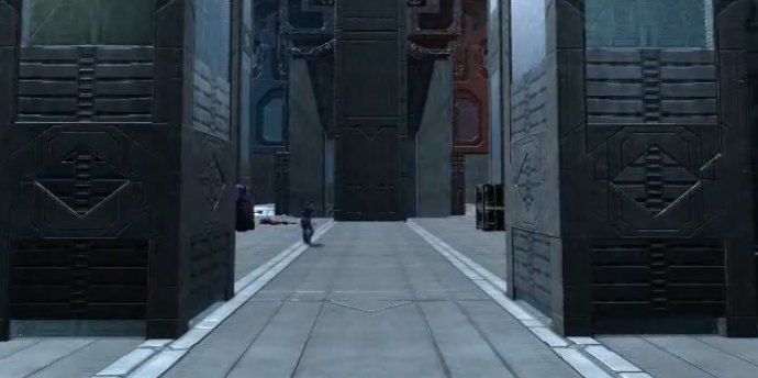
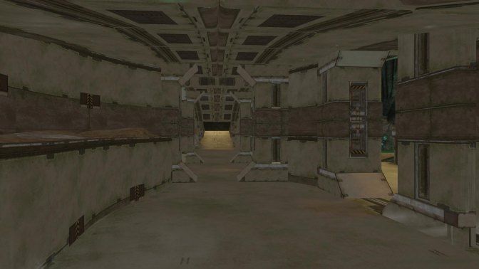
In some cases it can be as simple as lines that are not at the same elevation, or at angles to each other, of different thicknesses, or different colors to each other. They don’t create any kind of consistency, so they all clash against each other. Notice in the following picture that the line down the center walkway is off centered; the bands running horizontally on each side are different in both width, and in their heights off the floor; and that the vertical line running up the right wall serves no purpose other than to clash in pattern (it has no black lines in it) to the horizontal lines that it crosses. This is visual noise.
If you have lines running in both the x and y directions, and the block is placed where a Path may flow along the x axis, then the lines in the y direction are useless – they won’t look like they belong there. The same is true when lines wrap around the center of blocks or around the edges of the blocks. In those cases, the lines draw your attention to the block rather than any Path that flows over the block.
On the other hand, if the line that runs along the edge of the block is very subtle, then the block takes on a feel of a tile. A tiled flooring is not bad. In this case, the lines actually look like they belong there, because the floor looks like a tiled floor. The subtle contrast is enough to give you the feel of a tiled floor without trying to compete for your attention.
It isn’t just the lines on a block, but also lines through out the visual perspective. Take a ramp, for example. If a line on the floor runs up to it, but is off center to the bottom of the ramp, it looks like it shouldn’t be there – it looks like it is noise.
Take the example of a grill pattern at an entrance to a Space. If it isn’t lined up properly, if it is off to the side, it looks like the forger just slapped the block there and never concerned themselves with what it looked like. The grill pattern against an otherwise solid surface looks like noise, because it doesn’t look like it really belongs there.
Or take the various textures of the walls that are literally next to each other. If they all look different, if they all have different colors, patterns, and shapes, then they look like noise to each other, because they lack any cohesion.
There are blocks that use different colors, like the Halo 4 Ravine 4×4 corner. I have seen this used in a number of maps, and I have tried to use it myself. It is dog ugly, folks. Just avoid blocks that introduce the levels of ugliness and noise like this.
My number one goal in forging has become and remains to this day to utilize blocks with the most subtle changes in colors and the least geometric shapes on their skins (e.g., powder blue on white, rather than sharp black on white). I don’t always achieve this goal at every turn, but it is a great start to suppress visual noise from which I can build upon.
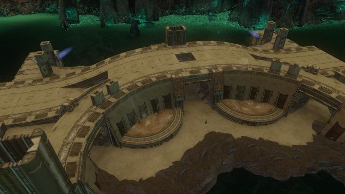
The central tower of Hekau is an example of where the numerous fine lines and powder blue bars were aligned with each other to make them look like the intended exterior paint job on the building itself. Maintaining the alignment in such a way that they look reasonable added to the beauty of the map. I didn’t like the visual noise that the sides of the stunt ramp offered, but the stunt ramp provided decent Geometry and the skins on the top and bottom were extremely helpful in creating a subtle Architectural appearance.
In one of my Erosion maps, which I consider to have the most beautiful skins I have ever seen, I merged the 2x3s with 2x4s where their common skin imagery blended. This allowed me to create curved ramps as underpasses to other curved ramps, creating a crafted look rather than forged look.
Notice how I was able to use the direction of the lines, both the fat bars and thin lines, to show predominate direction of travel across the structure. I wasn’t happy with some of the skins’ patterns, but I was able to leverage them very effectively by forming a pattern as part of the Architecture itself.
When you look at the skins of two blocks on Ravine, chances are you will see blushes of rust here and there. Take those two blocks and merge them together and you can see the corner of their merge by how the rust abruptly ends along the edge of the corner. Even if there was no rust, rather just a flat color, you could still easily see the corner edge of their intersection by how the colors of the two surfaces were slightly different. This in fact has always been the case even with every Canvas palettes on Reach.
But Halo 4’s Forge Island introduced a new concept, Blindness, where the corner of the intersection of two blocks simply disappeared from view. It isn’t clear why this happens. It could be a byproduct of the publishers’ attempts to reduce visual noise. And it happens typically only in the shadows of interior spaces where the detail is lost to blending with shadow.
This blindness is more of a distraction than visual noise ever could be, and for a very similar reason – it requires the player to concentrate on what they are looking at to understand what they are looking at. It is a huge distraction to the player.
If the environment you are forging includes blindness of edges and details, you want to make sure that no where does the blindness manifest itself.
Consider the next picture of the same Erosion map from above, in which the interior of the center structure leveraged the copper band at a singular height from the floor to give a solid Architecture. By maintaining a solid and consistent width through out the interior, the band becomes a striking Architectural feature rather than noise.
This is not the same as hopelessly aimless lines that go no where and thus have no real purpose other than the forger cannot get rid of them. And in many cases you don’t want Architecture void of contrasting elements. You just want the contrasting elements to contribute to the Architecture and never be a distraction.
Visual noise breaks cohesion of the Architecture and breaks immersion across the board. In some cases you might be able to use it, but usually it is just noise.
Blindness is worse than visual noise, because instead of trying to understand what you are looking at, you are trying to see what it is that you are looking at.
As a forger, you should avoid both extremes, and don’t be afraid to experiment with striking Architectural features.
What Is It?
Visual noise is noise that distracts from what is otherwise displayed on the screen. It is too much detail, too many colors mixed together, too much of too much in a small concentrated spot. And the worse case is when you use blocks whose skins are the source of the noise and are used everywhere. Then you have a map full of noise.To better understand what visual noise is, we could ask how it is introduced into a map.
Visual noise is created by things like thin lines of extreme contrast to their background that serve no purpose – like graffiti on a wall. Only they are worse than graffiti because they are not graffiti. Contrasts in fine detail can yield visual noise unless the fine detail looks like it belongs there. In most of the Canvases of Halo 4, you see fine lines that move along in all directions and you won’t be able to make them look like any of them are intended or were meant to be there.
In some cases it can be as simple as lines that are not at the same elevation, or at angles to each other, of different thicknesses, or different colors to each other. They don’t create any kind of consistency, so they all clash against each other. Notice in the following picture that the line down the center walkway is off centered; the bands running horizontally on each side are different in both width, and in their heights off the floor; and that the vertical line running up the right wall serves no purpose other than to clash in pattern (it has no black lines in it) to the horizontal lines that it crosses. This is visual noise.
If you have lines running in both the x and y directions, and the block is placed where a Path may flow along the x axis, then the lines in the y direction are useless – they won’t look like they belong there. The same is true when lines wrap around the center of blocks or around the edges of the blocks. In those cases, the lines draw your attention to the block rather than any Path that flows over the block.
On the other hand, if the line that runs along the edge of the block is very subtle, then the block takes on a feel of a tile. A tiled flooring is not bad. In this case, the lines actually look like they belong there, because the floor looks like a tiled floor. The subtle contrast is enough to give you the feel of a tiled floor without trying to compete for your attention.
It isn’t just the lines on a block, but also lines through out the visual perspective. Take a ramp, for example. If a line on the floor runs up to it, but is off center to the bottom of the ramp, it looks like it shouldn’t be there – it looks like it is noise.
Take the example of a grill pattern at an entrance to a Space. If it isn’t lined up properly, if it is off to the side, it looks like the forger just slapped the block there and never concerned themselves with what it looked like. The grill pattern against an otherwise solid surface looks like noise, because it doesn’t look like it really belongs there.
Or take the various textures of the walls that are literally next to each other. If they all look different, if they all have different colors, patterns, and shapes, then they look like noise to each other, because they lack any cohesion.
There are blocks that use different colors, like the Halo 4 Ravine 4×4 corner. I have seen this used in a number of maps, and I have tried to use it myself. It is dog ugly, folks. Just avoid blocks that introduce the levels of ugliness and noise like this.
Less Is More
Remember the lesson on Less Is More? The same is true with visual aspects of your map. The best looking maps have always been those with the least detail exposed on the skins of the blocks, have employed the least number of blocks possible, and have leveraged the subtle variations of the surface textures of the terrain as the visual foundation for it overall appearance and beauty.My number one goal in forging has become and remains to this day to utilize blocks with the most subtle changes in colors and the least geometric shapes on their skins (e.g., powder blue on white, rather than sharp black on white). I don’t always achieve this goal at every turn, but it is a great start to suppress visual noise from which I can build upon.
Working With Noise
If there are lines through out the blocks, I try to line them up in a way that they actually look like they were intended there, rather than they were just the skin on the block. The best approach to using lines in the skins is to leverage them as lines on a street. When they are used to indicate predominate direction of traffic, they can actually look like they belong there.The central tower of Hekau is an example of where the numerous fine lines and powder blue bars were aligned with each other to make them look like the intended exterior paint job on the building itself. Maintaining the alignment in such a way that they look reasonable added to the beauty of the map. I didn’t like the visual noise that the sides of the stunt ramp offered, but the stunt ramp provided decent Geometry and the skins on the top and bottom were extremely helpful in creating a subtle Architectural appearance.
In one of my Erosion maps, which I consider to have the most beautiful skins I have ever seen, I merged the 2x3s with 2x4s where their common skin imagery blended. This allowed me to create curved ramps as underpasses to other curved ramps, creating a crafted look rather than forged look.
Notice how I was able to use the direction of the lines, both the fat bars and thin lines, to show predominate direction of travel across the structure. I wasn’t happy with some of the skins’ patterns, but I was able to leverage them very effectively by forming a pattern as part of the Architecture itself.
Blindness
When Halo 4 came out, the blocks in the forge Canvases Ravine were horrendously noisy. The publisher responded to our complaining about visual noise (directly or indirectly, we really have no idea which) by giving us a detail blind palette in Forge Island. What do I mean by detail blind?When you look at the skins of two blocks on Ravine, chances are you will see blushes of rust here and there. Take those two blocks and merge them together and you can see the corner of their merge by how the rust abruptly ends along the edge of the corner. Even if there was no rust, rather just a flat color, you could still easily see the corner edge of their intersection by how the colors of the two surfaces were slightly different. This in fact has always been the case even with every Canvas palettes on Reach.
But Halo 4’s Forge Island introduced a new concept, Blindness, where the corner of the intersection of two blocks simply disappeared from view. It isn’t clear why this happens. It could be a byproduct of the publishers’ attempts to reduce visual noise. And it happens typically only in the shadows of interior spaces where the detail is lost to blending with shadow.
This blindness is more of a distraction than visual noise ever could be, and for a very similar reason – it requires the player to concentrate on what they are looking at to understand what they are looking at. It is a huge distraction to the player.
If the environment you are forging includes blindness of edges and details, you want to make sure that no where does the blindness manifest itself.
Striking Features
All of this discussion on visual noise should not be confused with striking features of Architecture. Bold, thick, solid patterns on a skin repeated across a structure can be used to enhance a strong Architectural Theme. For example, the large black pattern repeated across the wall in Hekau doesn’t stick out as noise, but as a bold Architectural feature.Consider the next picture of the same Erosion map from above, in which the interior of the center structure leveraged the copper band at a singular height from the floor to give a solid Architecture. By maintaining a solid and consistent width through out the interior, the band becomes a striking Architectural feature rather than noise.
This is not the same as hopelessly aimless lines that go no where and thus have no real purpose other than the forger cannot get rid of them. And in many cases you don’t want Architecture void of contrasting elements. You just want the contrasting elements to contribute to the Architecture and never be a distraction.
Summary
Visual noise is a distraction to players, most notably because it requires the player to concentrate on the noise and understand what it is he is looking at.Visual noise breaks cohesion of the Architecture and breaks immersion across the board. In some cases you might be able to use it, but usually it is just noise.
Blindness is worse than visual noise, because instead of trying to understand what you are looking at, you are trying to see what it is that you are looking at.
As a forger, you should avoid both extremes, and don’t be afraid to experiment with striking Architectural features.
Immersion
Creating Immersion
There may be other ways to create an immersing environment in your map, but the best way I know of is through Theme. By forging a Theme into your map, you place the players somewhere. If they recognize the Theme, it becomes easier for them to feel like they are there. It helps them to see themselves where the Theme suggests.It is important to create a Theme that is new, yet very concise and obvious. The first map I saw that fit this was Affinity[1], which presented a Forerunner Theme.

The reason Affinity was such a success in this respect is that the Architecture was unified through out and it leveraged the Forerunner Theme of the Canvas’ palette. Playing the Theme of the Canvas’ palette adds strength to your map’s ability to immerse a player when it is working with you rather than against you.
Sustaining Immersion
Sometimes you need some extra scenery, like the barricades at the bottom of the central tower in Hekau, not to add cover, but to help the Theme come alive. The barricades at the bottom of the central tower make the central tower seem more realistic, because the way they are positioned in a circular pattern suggests that the ground level of the central tower has a purpose other than just being there for the sake of the map. The presence of the barricades suggest that the structure itself is used to protect whatever is in the center of the ground floor, and they do this by suggesting that they themselves are an inner wall of protection to that same end. The barricades can be used for cover, but their primary purpose is to deepen the immersion that a player experiences as they walk into the ground level of the central tower.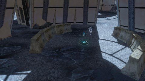
I also believe that leveraging the terrain helps a lot in creating a Theme for the purpose of immersing players. Given the textures on the blocks in any palette, the details of the Canvas really should be leveraged. If for no other reason, the terrain can help prevent repetitive, boring Architecture. On the other hand, the terrain becomes a part of your Architectural Theme – indeed, it becomes the foundation for your map’s Theme.
Breaking Immersion
It is much easier to break immersion than to create it or sustain it. Breaking immersion simply requires a flaw such that players see, do, or in some way experience something that they shouldn’t see, shouldn’t be able to do, or should never experience. And there are too many ways to accomplish any of these.From a visual perspective, anything that the player sees that looks out of place has the potential to pop the player out of immersion. One of the more difficult things you as a forger will face is to create a unified Theme through out your map where everything seems to belong to the Theme. But there are other ways to create visual features that break immersion.
Visual noise can distract a player so much that they can no longer feel like they are in the Game Play, because they are trying to process the map features. When Halo 4 came out, the first thing I realized was that each forge Canvas’ palette was full of noise. Needless to say, nearly every community map was visually noisy through out, and I dreaded playing on any of them just for that reason alone. I will talk more about visual noise in more detail later.
Structural detail can fail to line up, drawing the attention of a player to the fact that the blocks themselves are blocks.

Z-fighting can distract the player and remind him that the structure is made of forge blocks.
When the forging community began seriously forging for Reach’s Invasion, one approach they adopted to improving video rendering performance was the gating of blocks. Literally blocks would disappear when they were no longer needed. Not only did it kill immersion, it was simply the wrong way to achieve good video rendering performance. The proper way is to reduce the block count. If the map cannot be forged due to the blocks that would have to be removed, then the map becomes an impossibility. Altering the map’s Geometry is acceptable only when the Game Play lends to it – like when a wall is destroyed by a bomb exploding. Never gate blocks out of view.
And then there is the teleport. The teleport can be notorious for breaking immersion in a number of ways. You can instantly find yourself in a room that looks dramatically different than where you entered the teleport. You can sense a massive disorientation by utilizing the teleport. Where the teleport takes you can leave an unintuitive experience, like it really should have taken you somewhere else instead.
Teleports have a good purpose but you really need to utilize them judiciously and carefully. Teleports are an exercise in minimizing disorientation and as such require extra attention to how a player will perceive the overall experience. Pass through the teleport and stop on the receiver pad. Ask yourself What does the player see? Ask the correct questions.
The Symmetry Problem
The biggest problem with symmetrical maps is that by the very nature of their symmetry they look artificial. There are a few reflective translation maps that do symmetry proud and fully immerse the players into the Theme of the map despite their strict adherence to symmetrical design.Take Narrows for example. Have you taken the time to look out across the gorge? You would see another bridge structure spanning the gorge just like the one you are standing on. The bridge is fully symmetrical, and it works very well as a symmetrical map, because bridges are symmetrical in real life. The bridge structure off in the distance was put into the Canvas to help immerse the players on the bridge that forms the map.
And it isn’t enough to just create a bridge structure as a Narrows remake, for example. You need the full context of why the bridge is there. Forge in the gorge. Forge in another bridge structure way off in the distance if you have to. Take the time to build the Theme to give your map a context to immerse your players in.
Countdown, a rocket launch facility, has a fully reflective translation design using the center as a rocket exhaust well. The well gives the designer the opportunity to surround the well with rings of platforms in a fully symmetrical Architecture. The facility looks extremely believable as a result.
Haven looks sort of like an alien religious order site, and the circular hallway around the perimeter makes it look alien and gives all the reason to expect the map to be symmetrical. The symmetry fits the Architecture very well.
Summary
Forging a unified Theme through out your map is a good foundation for creating an immersing environment. Leveraging the Theme of the Canvas’ palette is also a good start.Additional scenery can be useful to sustaining immersion as players move about your map.
Anything out of place can break immersion, leading the player to feel like they woke up from playing in the game to playing a video game.
Symmetry aids in immersing players when symmetry is expected within the Theme of the map.
_______________________
[1] Affinity, Halo: Reach, by Godly Perfection
Aesthetics, Art & Architecture
Aesthetics
At its very core, the term Aesthetics means The study of beauty and the emotions. But forgers use the term Aesthetics in place of the word Art when discussing a map’s beautiful Architecture or Artistic elements. Instead of saying, Your map has great Aesthetics, one should say, Your map is beautiful, or Your map is very artistic.The emotions that a game can invoke include the emotions that the map invokes, or the emotions that the map supports (or fails to support). In this way the Aesthetics of a map are best understood as how the map contribute to the Aesthetics of the Game Play. In this context, it becomes a study of how the map contributes (or fails to contribute) to the emotions or the emotive context of the game itself.
A Penny Arcade video made by Extra Credits talks to The Aesthetics of Play, in which they study nine emotive elements that video games tap (usually only two or three in a single game) as the reason a player keeps coming back for more. They discuss how a game, through its collective experience from the Game Play, produces an aggregate of emotions that a player enjoys. In this sense it is a study of the emotions that Game Play produces in a person.
The nine include Sense Pleasure, Fantasy, Narrative, Challenge (not the same as difficulty), Fellowship (cooperative, teamwork), Competition (games allowing us to express dominance), Discovery, Expression, and Abnegation (unwinding, not having to engage our brains). Each is, the best that I can describe here, a discipline of emotion. Games provide players with usually two or three of these at a time. For example, Halo multiplayer isn’t a game that provides discovery, because it is an Arena style shooter. But it does offer fellowship and competition.
Aesthetics can be driven through the quality of the visual components (the quality of the unifying and beauty of the Art forged into the map); but it also includes the emotions created by the sounds and music, the mechanics, the team play, the wonder of exploration, and so forth. Aesthetics is the collective emotions that a player feels when playing the game, and only some of what he feels is driven by what he sees. And by now you can see that forgers have extremely limited control over making great Aesthetics – most of Aesthetics are built into the game and cannot be altered.
The sound of Jeff Steitzer’s voice can invoke desired emotions in the context of the Game Play. Imagine for a moment how you would feel during the game if you heard the voice of Bruce Willis, Tom Hanks, or Sylvester Stallone? Or of Nicole Kidman, or Demi Moore? Some of those voices may seem attractive, but in the context of the Game Play, they clash, they stand out, they don’t feel like they belong. They create a flaw, a rip, in the painting that we view as the Artistic qualities of the Game Play.
Once you understand that Aesthetics encompasses every sense of the player, you then realize that Art and Architecture are tools of the forger to complete the Aesthetics on their maps. Those are pretty much the only elements of the whole realm of Aesthetics that are under a forger’s control. (In this sense it might be considered proper to use the term Aesthetics in referring to how a forger employed Art in their map, but the term is too broad for me to consider using in this context myself.)
Art
Art is what most forgers mean when they use the term Aesthetics. They are talking about how beautiful a map looks. But when you think about it, you need to step back and look at why a map looks beautiful. Generally it is due to the Architecture presenting itself in a way that people see as unusually good, very pleasing to look at. This is where Art comes in. We can say that the Architecture employs wonderful Art.At the same time it is important to point out that Art is perhaps the most subjective term one can use as a forger. Art is literally bound and gagged by the adage, Beauty is in the eye of the beholder. Others may not agree with your assessment of how beautiful your map actually appears.
Every forger has artistic talent in degrees – some far more than others. Art – or how to make beautiful maps – is so subjective, I don’t know if anyone can teach you how to go about creating it. It is something that I feel a forger can only be inspired with.
In a nut shell, beauty makes your map more interesting. If the beauty is found through out the map, then your map is interesting through out. If your map is beautiful only in one corner, then it will be interesting only in that corner. When people play on a map that is beautiful through out, they find it interesting to play on, because of how the map makes them feel.
If you get nothing else out of this chapter on Art, get this point here. People enjoy playing on a beautiful map, because they enjoy how the map makes them feel when all they do is look at it. Can you see how important Art can be?
And while it is also worth noting that a beautiful map that plays good will usually win over a great playing map that looks like nothing more than a pile of blocks, don’t think for a second that a beautiful map that is boring to play on will be taken seriously.
All that aside, Art is expressed most often through the Architecture of structures.
Architecture
Architecture is what you think it is. It isn’t a subjective term like Art, and it isn’t a wide ranging conceptual term like Aesthetics. It literally is just how structures appear, the artwork carved into the structures, Walkways, etc.The key thing that matters is unity – that the Architecture of every structure is the same or that they have the same common Architectural Theme that unifies them as one solid Architecture. Likewise, it is important that the Architecture produces or promotes cohesion with the Canvas the map is forged on. You would never create a barn yard map on Impact; and you shouldn’t try to create a space station on Ravine.
Any interruption in an Architectural Theme can make the interruption stand out like trash on a pristine street corner. It almost always breaks cohesion with the rest of the map, making a distraction or even visual noise that consumes the brain processing power of a player who would prefer to concentrate on Game Play. Interruptions or even distinctively different Architectures make you look like you never really knew what it was you wanted to forge in the first place – or you never cared to begin with.
Architectural Theme carries with it more than the Architecture of the structures you forge. It also ties in the layout of the map, the Geometry that defines where the structures are related to each other, how much space exists between structures, how the Walkways connect the Spaces, etc. In some Game Types, like Invasion, it goes even further to include which Race is the defender, and does the structural Architecture present strong cohesion to the defenders’ race? You would never expect to see the Elites defending a Spartan facility, yet you would expect to see Elites defending a Forerunner facility.
It is through a quality and unified Architecture that your map can express enormous Artistic qualities that can add tremendous value to your map.
Implementing Art
I can only share how I go about forging Art into my maps. I would never tell you what steps you should follow, because I believe everyone works a little differently.I begin by playing around with blocks of various kinds, trying to achieve the right combination of skins to form some type of structural Architecture that I can spread through out the map.
Once I get the idea of what I want the Architecture to look like, I then go about creating the necessary Geometry for the map size and Game Play I want. I do this while implementing the Architectural Theme through out. It is during this phase I learn if I have enough blocks, what kinds of trade offs I must endure, and if the Architecture remains fully unified through out.
After this, I optimize the structures, looking for replacement blocks, or eliminate blocks, to maintain split screen performance. And while this may seem like a minor issue, it is critical in how the final Architecture will turn out.
Eventually I have a map that I try out and see if it plays well and is well received for a variety of reasons.
Summary
Aesthetics is far more than Art, and is the wrong word to use when discussing the quality of a map’s Art or Architectural theme.To achieve quality Art on your map, you need to have some artistic talent and you need to have an eye for what people will enjoy looking at.
To achieve unified Architecture through out your map, you simply need to be disciplined never to interrupt the Architectural theme.
It is my opinion that anyone can create any Geometry, but it is the Art behind the Architecture that is the real burden on the forger.
Chapter 2: Art
At the core of this debate is the question, What is a map? To say that a map is defined by Game Play alone is like saying Aesthetics is defined by Art alone, and I find that perspective extremely short sighted. A map is far deeper than Game Play, just as Aesthetics is far deeper than Art. In fact, I will go a step further and say, A map requires both Art and Game Play, or it isn’t a map at all.
Instead of looking through the palette for pieces with the necessary Geometry while relegating skins as optional just to accomplish the Geometry of the map, look for pieces with both the necessary Geometry and the necessary skins. If the palette lacks the pieces you need, then recognize that the map is an impossibility and move on. I know that this raises the bar and you may feel you are disadvantaging yourself from the other forgers who couldn’t care less about Art. But I wouldn’t tell you to do something that I do not do myself.
I am sure that all of us want to make a great playing map that also looks outstanding. But what is important is the total quality of the map – at least that is important to me. So it becomes essential that we recognize and accept when a design becomes an impossibility and start over. Ultimately this discipline – or lack thereof – may indicate the forger’s priorities.
Don’t be so desperate to make a map with great Geometry that you forge nothing more than a pile of blocks. Rather, be desperate to discover what is possible in its fullness and bring those possibilities to fruition. Don’t become so desperate to get a map into the playlists that you would sacrifice its Art. Be desperate to find playlist worthy maps that can be fully forged.
In this chapter I will show how Art, Architecture, and Theme can make your map more interesting and more fun to play on; and I hope to demonstrate the value of maintaining the discipline necessary to add each of these to your map. But my greatest hope is that you both see how important it is to have both Game Play and Art, strive to achieve both equally as much as you know to do, and develop the willingness to walk away from impossibilities in your quest to forge a wonderful map.
Tuesday, August 19, 2014
Vehicles
Vehicular Power
When we talk about the power of a vehicle, we are talking about its aggregate power. This includes how much kill power it can produce and how much kill power is necessary to take it down. The more powerful the vehicle, the more counter measures the other team will require, or the Game Play can become severely unbalanced. For example, in Halo 4, I was advised not to include a Mantis unless the teams had at least six players. I looked and could not find a map in a 5v5 playlist that had a Mantis. You need to consider that the size of a team is a degree of counter in and of itself, because they represent the number of players that can fire upon a vehicle.Vehicular power can also be measured in part by the number of players necessary to operate the vehicle fully. Requiring more players is a negative for overall survivability and offensive capabilities, because you may not have a team mate immediately available to help you utilize a vehicle.
The Warthog is a good example. You cannot shoot and drive at the same time. You need a gunner to make the Warthog any kind of offensive weapon (the tiny segment of the Halo population that is into splatters is too small to factor in here). The scorpion is a good example of a one person offensive weapon system, but a second player adds significantly to its survivability.
Vehicular Purpose
The purpose of vehicles on your map is to provide teams with means to interact with each other in ways that are beyond the typical infantry weaponry, and thus increase the fun factor across a wider range of players. Typically you see more vehicles with more players, so that there are more ways of players to Engage each other, nothing more.New strategies can be implemented with the introduction of vehicles. Larger maps for larger teams offer more room for vehicles to execute new strategies. And the type of vehicles you add determine how the Game Play will enhance.
For example, Scorpions and Wraith have their greatest success as defensive weapons as they help to control their team’s side of the map. This isn’t to say that one cannot push forward with a Scorpion to dominate the other team’s side of the map. But the point is that these tanks are slow and more effective more often when kept back as defensive weapon systems.
The Gausshog, on the other hand, can deal an instant killer blow with a single shot on target like a Scorpion, except it doesn’t produce the same wide spread damaging shock wave that the Scorpion’s shell does. The Gausshog is far more maneuverable than the Scorpion and can readily lend itself to flanking the enemy with deadly precision and excessive kill power. But like any Warthog, it can support flag capturing behind the enemy base, run circles around pockets or other slow vehicles like the Wraith or Scorpion, distract and duck behind cover, etc.
There is a vehicle for just about any kind of Game Play experience and balance for a map. As a forger, you need to decide why you want a vehicle, and then choose the vehicle that will provide you with the desired Game Play for your map, while not creating other issues. One of the concerns you need to address is how will people use the vehicles? As you intend them or in ways that they feel are more advantageous?
Keep in mind that you cannot just drop a vehicle onto a map to achieve the Game Play that vehicle offers most. The map must support the Game Play as well. The vehicle must support the map, not usurp the map. What I mean by this is the vehicle you place on the map should make the strategies and the Paths that your map has to offer work well or even better with the vehicle; the vehicle should not alter in significant ways how the map plays other than adding the variety of Game Play that the vehicle itself has to offer. Another way of looking at this is that the vehicles should flow with the Geometry, not break the intent of the Geometry.
Going Heavy
This last point is very important for heavy variants of large team maps. Adding a tank to a map may break the map or alter the Game Play significantly than the original version of the map that may have only light vehicles on it. Clearly the term heavy originally came from the fact that the heavy class of vehicles are added to a map. But you don’t always need a heavy vehicle to make a heavy variant of a map. A more meaningful perspective of a heavy variant is simply more vehicular Engagements – there are simply more vehicle on vehicle encounters to be had and with a wider variety of fire power to choose from. [1]Vehicles are about encouraging a wider range of Engagements between opponents. Going heavy is about encouraging more vehicular Engagements with a wider range of vehicles to choose from still.
Anti-Vehicular Weapons
The laser is a classic example of an anti-vehicular weapon that has no other real value. Yes, you can use it in shooting other players, but it isn’t nearly as efficient as the sniper or DMR for taking down infantry. One can say it really works wonderfully against any vehicle, and that it is perhaps the best long range anti-vehicular weapon in Halo. The laser is a prime example of a weapon you do not want on your map unless you have a vehicle – in which case you do want it on your map.But also consider, again, the sandbox performance data of all weapons. For Reach and Halo 4, the sniper is a good anti-vehicular weapon, and as such adds some additional dynamics when vehicles are added to the map. Unlike the laser, the sniper now has to ask himself if he wants to save his sniper rounds for a scorpion or banshee (or yes, even a Warthog), or does he want to share the love with his adversarial infantry? The point is that the sniper can add additional decision making burden upon a player’s strategy, and this in turn can help make your map more interesting to play on.
Plasma grenades and plasma pistols are very powerful anti-vehicular weapons. In Halo 4, these were a love fest amongst many Big Team Battle players who would load up their personal load outs with both.
When planning to add vehicles, you need to consider the anti-vehicular weapons you want to deploy as counter measures. There are two groups of players you need to forge for – the vehicular lovers, and the infantry lovers. The balance is not always easy to find, but you need to forge your map for both groups if it is going to gain wide spread acceptance and appreciation.
Summary
Vehicles add more Game Play dynamics and are necessary for large teams, but you don’t want too many vehicles – not everyone should be in a vehicle.Widening the variety of vehicles with the correct choice of vehicles is more important than having a heavy class vehicle for the sake of having a heavy class vehicle.
The right vehicles should help the map work as it was originally intended, not alter it significantly.
Consider the various weapons that are anti-vehicular and what roles they can serve, and what decisions players will encounter as a result.
_______________________________
[1] HWM Sarge – Heavy Enough?
Subscribe to:
Comments (Atom)